Paint that cleans your air
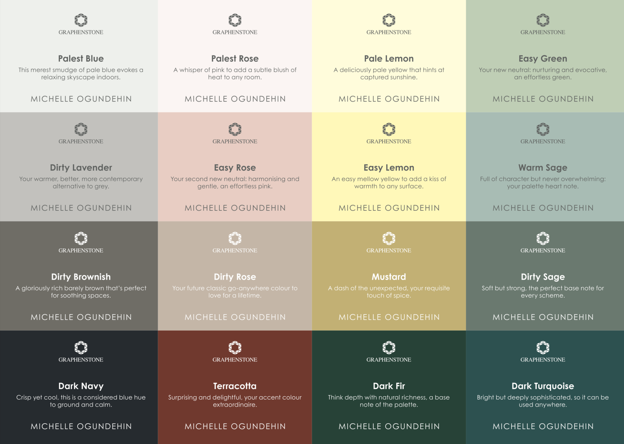
The Michelle Ogundehin x Graphenstone Collection comprises sixteen soothing shades lovingly crafted to be combined any way you want — they will always work perfectly together. Designed for wellbeing, selected for ease: it’s a foundational colour palette for your entire healthy home.
The core colours spring from the softer side of the green and blue families. However, dirty touches stop it becoming too languid, and a dash of the unexpected adds that all important spice. In short, everything you need to set the mood music of your home to cohesive, considered, and healing.
Important Note: Graphenstone UK have now been acquired by Osmo, the green and clean natural oil and hard wax wood finishing experts. This is an exciting new development, and a new website is therefore under construction. Due to launch in January. In the interim product links are currently unavailable.
The Michelle Ogundehin x Graphenstone Collection
 Why Graphenstone?
Quite simply, we are united in our vision to help people create environments in which to thrive. Because, this is paint that purifies the air inside your home by absorbing carbon dioxide as it cures (the majority in the first 30 days after painting). Let me spell that out — it’s paint that cleans your air! It also limits pathogens, and prevents mould growth, fungi and bacteria.
Graphenstone’s GrafClean paints also have only trace levels of VOCs (less than 0.1%/litre). These are breathable mineral-based paints that use a range of universal and metal oxide pigments, have no added micro-plastics and virtually no smell! For durability, they also contain a remarkable substance called graphene (a non-toxic pure inert carbon 200 x stronger than steel) which provides excellent coverage combined with washability. They contain no additional chemical preservatives either, using natural lime instead to increase the pH, although some raw materials contain the tiniest amounts, at just 0.05% — truly trace level.
As such, it can truthfully claim to be one of the world’s most widely certified eco paints, on everything from its positive impact on air quality, to having one of the lowest carbon footprints in the industry. The paints are also manufactured using renewable energy and utilise the waste olive pits from the local olive oil industry as part of the biomass fuel. Even the paint tubs are made from 100% recycled materials and are fully recyclable. I mean seriously, what’s not to love!
Used by Facebook for its London offices, The Eden Project, and Historic Royal Palaces and working in partnership with English Heritage from 2025; if it’s good enough for them, it’s perfect for you.
How did I create my collection?
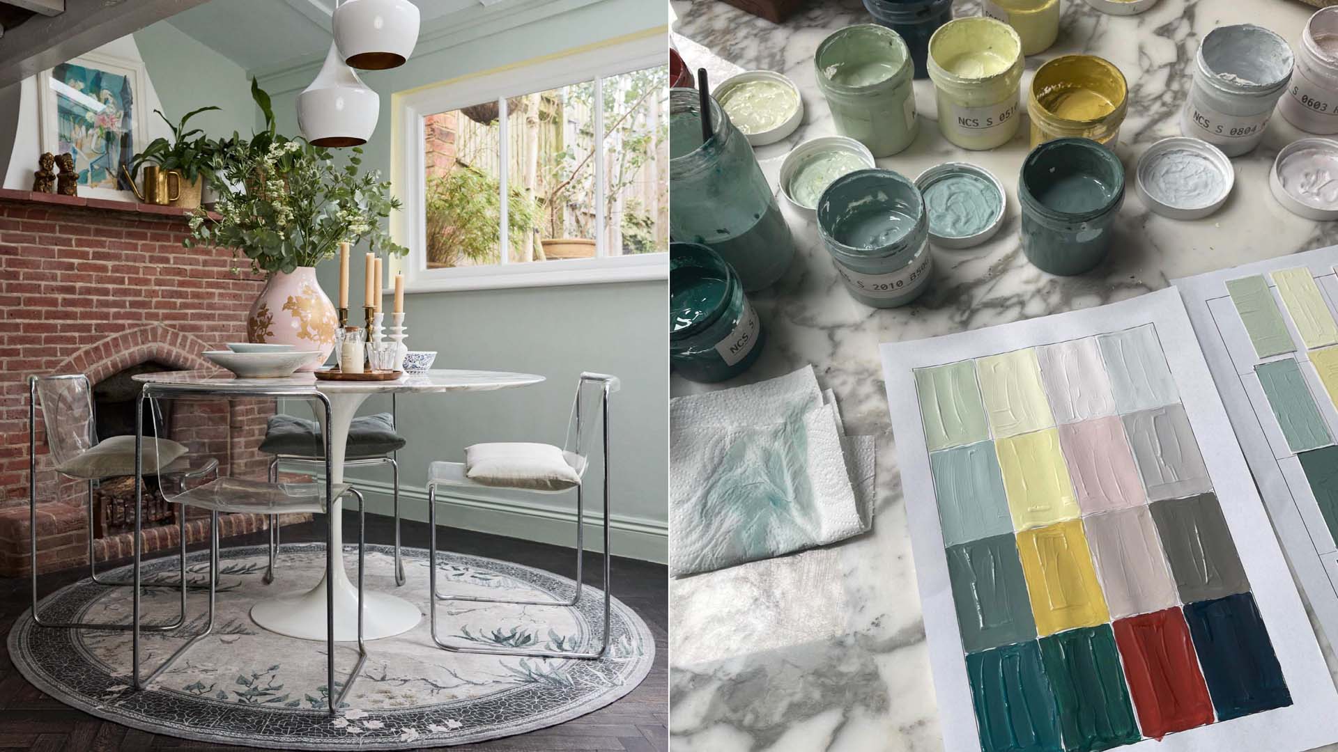
 To start, I conjured the feel I wanted through mood boards and visuals: relaxed, soothing, restorative but with a dash of intrigue. This was to be a palette that felt warm, rich, full of delight but never overwhelming. I always feel that you, the homeowner, must be the star attraction of your home, but the colours you choose to envelop yourself in must be an active player in its mood music.
Additionally, I was frustrated by colour launches where the shades individually might be beautiful, but they wouldn’t work together, so the consumer was left to do all the hard work of finding coordinating hues. Or typically, they’d be reduced by decision paralysis to one colour, probably pale, and white. No more I thought!
I began by playing around with blues and greens, the elemental colours of sea, sky and earth, and painted sheet upon sheet with samples, blending and comparing, sorting and choosing. Slowly, the mood began to come together. But because the USP of this collection is that every shade is designed to work perfectly with any other, over the period of several months, even more samples were tried until sixteen complementary shades were finally selected.
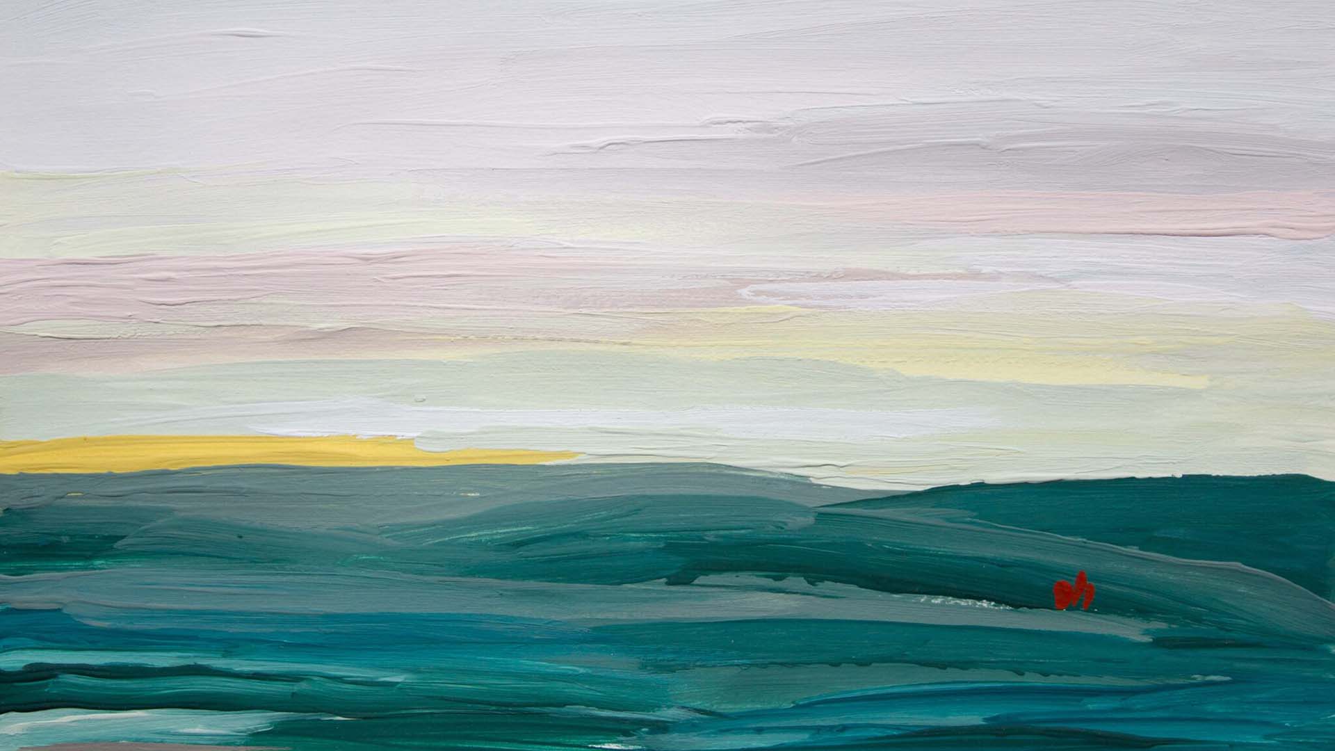
And to test them… I have an unusual approach. I make lots of little paintings! On paper, not walls. Because the colours are inspired by nature, to me it makes sense to return them to nature to really see if they work. In other words, can I paint a landscape with my colours? This enables the final tonal tweaks. The last adjustments to ensure the colours are truly cohesive and considered.
 Click the links to go through to the main Graphenstone website. You can order a colour chart and samples from there too.
Pale Lemon 001: A deliciously pale yellow that hints at captured sunshine.
Easy Lemon 001: An easy mellow yellow to add a kiss of warmth to any surface.
Mustard 001: A dash of the unexpected, your requisite touch of spice.
Terracotta 001: Surprising and delightful, your accent colour extraordinaire.
Easy Green 001: Your new neutral: nurturing and evocative, an effortless green.
Warm Sage 001: Full of character but never overwhelming: your palette heart note.
Dirty Sage 001: Soft but strong, the perfect base note to every scheme.
Dark Fir 001: Think depth with natural richness, a base note of the palette.
Palest blue 001: This merest smudge of pale blue evokes a relaxing skyscape indoors.
Dark Navy 001: Crisp yet cool, this is a considered blue hue that grounds and calms.
Dark Turquoise 001: Bright but deeply sophisticated, so it can be used anywhere.
Dirty Brownish 001: A gloriously rich barely brown that’s full of gentle warmth.
Palest Rose 001: A whisper of pink to add a subtle blush of heat to any room.
Easy Rose 001: Your second new neutral: warming and gentle, an effortless pink.
Dirty Rose 001: Your future classic go-anywhere colour to love for a lifetime.
Dirty Lavender 001: Your warmer, better, more contemporary alternative to grey.
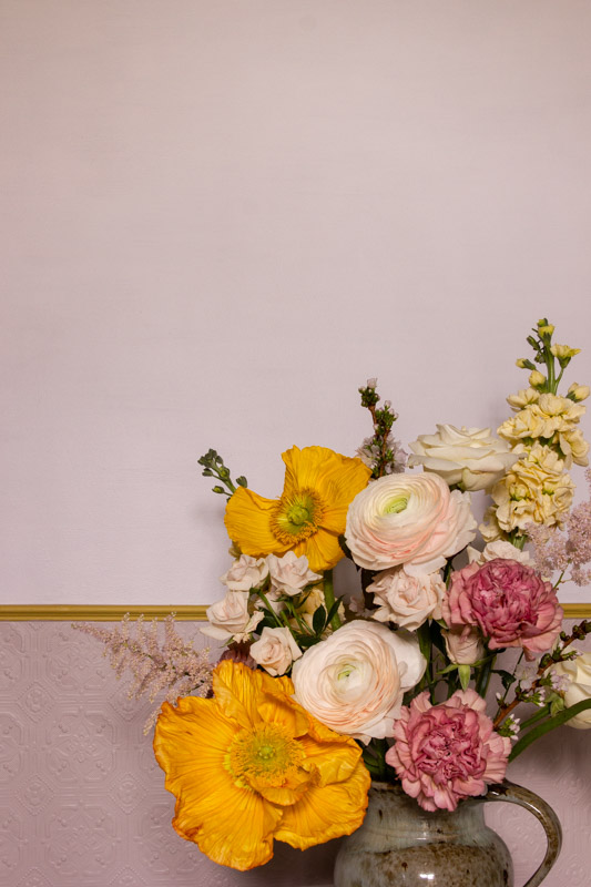
Michelle Ogundehin x Graphenstone. Palest Rose on upper wall, Dirty Rose on lower panel; Mustard on dado trim. Photograph: Emma Harris
You are what you breathe. You deserve clean paint!
Because most paint isn’t clean at all. See my Let’s Talk About Paint post.
Preview: here’s a really punchy fact. Did you know that most paint is 37% plastic? And exterior gloss can be up to 90% plastic! According to a comprehensive 2021 report from the Swiss-based scientific research consultancy Environmental Action, paint is “the largest source of micro plastic leakage into the world’s oceans and waterways, outweighing all other sources of micro plastic leakage (textiles, tyres and pellets)!” How does it get there? A combination of leakage during application, wear and tear, maintenance and end of life disposal — every year 14,000 tonnes of paint go to landfill! As the report concludes, “the global contribution of paint to plastic leakage has been largely overlooked.”